
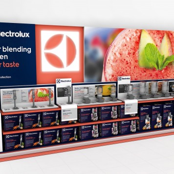
The right harmony between past and future is what Electrolux wants to transmit to the public. This is why the company has conceived a new visual identity for its brand. Refreshing the iconic logotype and setting new distinctive standards for imagery and colors, the design is created to have more stopping power and stand out from the crowd wherever consumers meet Electrolux.
“Electrolux is on a journey to become a world-class consumer marketing company, with a clear focus on consumer driven innovation and strong brands. A key ingredient of this is to create an exciting and differentiating brand experience that is consistent across every consumer touch point. Our new visual identity will help us achieve that, in a digital and retail landscape that has changed dramatically over the past years,” said MaryKay Kopf, chief marketing officer of the Electrolux Group.

For the company name a new font, exclusive for Electrolux, has been selected, maintaining the Electrolux’s historical and timeless symbol, first used in 1962.
“A visual identity is much more than a change of logo and color palette. It represents a new sense of Electrolux as a brand, what we and our products and services stand for and how we want to be perceived,” MaryKay Kopf said. “The new visual identity will build greater recognition by engaging people in a positive and emotional way; helping to inspire them, identify key benefits and find what they are looking for.”
The new visual identity will be extended to all the Electrolux world and products: in-store, on-line, on packaging and through mobile devices.


